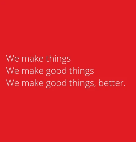
Good design is a work in progress
Have you heard of Comet Server and seen the changes we’ve been making? Basically, Comet Server is the heart of the system that directs and manages the flow data from your customers. Recently we’ve been making a few changes to the server, in terms of appearance and refining the layout.
If you're familiar with the server, things will look a bit different. As with everything, we’re always looking for ways to improve and make things better. This is done through an approach of continuous refinement which is also referred to as ‘Kaizen’ in Japanese and famously popular with auto manufacturer Nissan. So what you’re seeing isn’t a final product, its instead but one of many steps forward.
Originally it was a very raw interface with minimal design, so we’ve improved the previous navigation, put things in more obvious places, inserted page titles so that you knew where you were, etc.
We wanted it to feel like a modern, slicker UI with better coherence building on our initial design, which we recognised could be made more friendly. Don’t get me wrong, nothing about the previous design is bad, but it lacked the warm intuitive element we wanted.
We’ve also made it more consistent with our overall Comet branding. Also now there’s visual configuration options in the web interface to configure storage vaults, protected items and the server itself.
The challenge when designing intuitive interfaces is that it needs to be just that: intuitive. Steve Krug wrote a seminal book on usability entitled "Don’t make me think”. It’s this simple philosophy that has shaped the look and feel of the server.
Like all good design, you probably won’t notice the design and thought has gone into it in the first place. This is exemplified with the advent of many smartphones that do not come with instruction manuals.
What’s your take on intuitive design? Is it important or do we place too much emphasis on it?