Evolution of the Comet client
It's been a journey to get Comet to where it is now. One place that it's really visible is in the visual evolution of the client. In this post we go behind the scenes in the client and our considerations. Enjoy!
Comet 0.0.20160225 (2016-02-25)
This was our pre-pre-pre beta. This was our first development milestone. Although, most basic features were functionally working.

This version of the software was written in C#, instead of our current Qt interface. Originally, we were going to make separate Comet frontends for each platform, using native technologies (WinForms and C# on Windows, Cocoa and Objective C on OSX), but when prototyping the Qt version for Linux machines, we became very happy with Qt’s cross-platform design on all operating systems.
Comet still retains its frontend / backend design, so if there are other more diverse operating systems to support, we can develop a dedicated GUI and still retain most of our technology. For example, mobile devices might benefit from a completely custom mobile-first interface, while still using the core Comet technology.
We were also considering licensing the GUI source code, so MSPs could make more radical customisations. It’s all possible because of the split GUI and backend design.
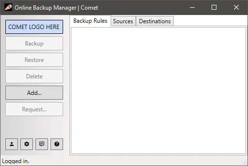
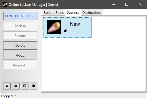
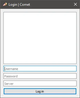
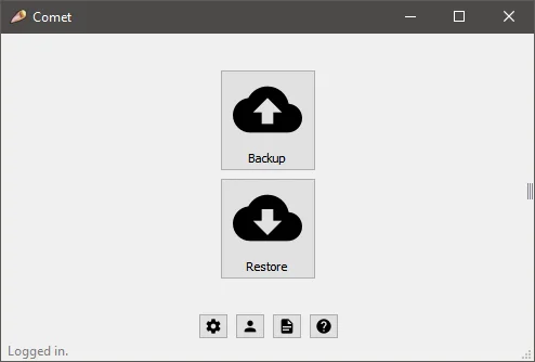
Protected Items (“Sources”) showed up as icons, rather than in a list.
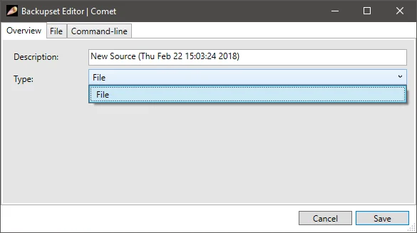
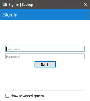
This dialog looks somehow familiar even today.
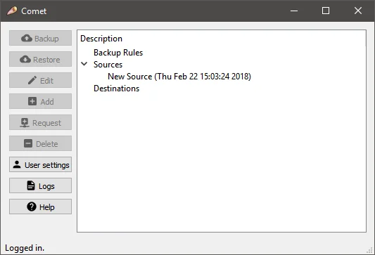
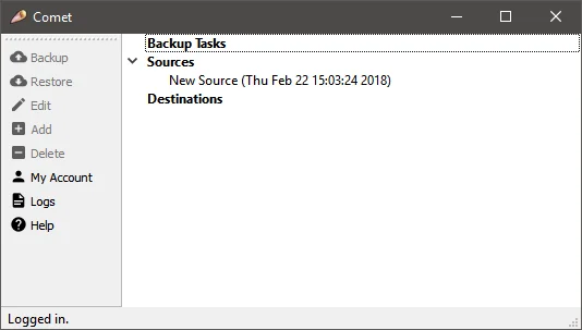
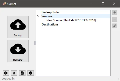
A lot of the terminology hadn’t been standardised yet. We used “Sources” and “Destinations” as the names for a long time. These old versions of Comet Backup are still API compatible with current versions of Comet Server, and you can see this old terminology in some places in the API.
Comet 0.0.20160301 (2016-03-01)
The top box was going to be a web view for MSP news.
Compared to the C# prototype, we lost the concept of multiple tabs. We kept the idea of buttons that greyed-out depending on the selection context.
Comet 1.0.0 (2016-03-30)
The bar on the left has a more modern design, and could be dragged up to the top.

A lot of the dialog windows still look the same today!
Comet 1.1.0 (2016-04-05)
Just a small evolution. But we spent a long time tweaking this design.
Comet 1.3.0 (2016-04-29)
Around this time we had hit a stagnant point with our UI design and wanted to innovate by trying something quite different, that would simplify the common operations.
The right-hand side of the screen animates over when you click on it:
Or, you could click the first “cog” icon to play the animation.
Comet 1.5.0 (2016-05-31)
The UI was overhauled again. This also introduced the third-generation application icon (the current Comet logo is our sixth-generation icon).
The interface was tweaked further, but kept this basic design for a while.
Comet 2.4.0 (2016-10-11)
This is an example of a more modern interface from this time period.
The box for MSP news has disappeared. It didn’t really make sense if you could only see the news in the login dialog, which would log in automatically anyway.
MSP News would eventually return as a feature of the main interface, built-in to Comet Server, rather than a web view.
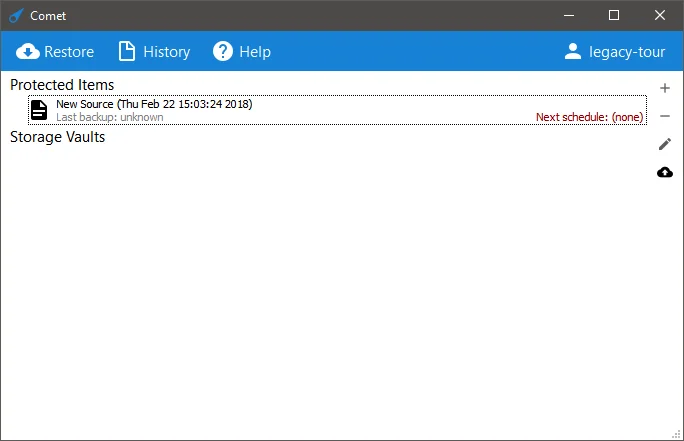
By this time, the interface had been simplified to only show operations when you hover on the row.
At this point we went much wider and bolder on the graphical design for Comet:


Our main problems with this initial pass was that it felt very 'busy' with all the buttons and just wasn't right.
Comet 2.8.0 (2016-11-28)
We introduced this brand-new theme to more MSPs.

Actually, we got pretty close to the modern design, on the first try.

The history page showed all jobs in the top section, and job details in the bottom section. This is how Comet had been since the early 1.x releases. Nowadays, the report views open in a popup window.

The Account page didn’t yet have its modern design.
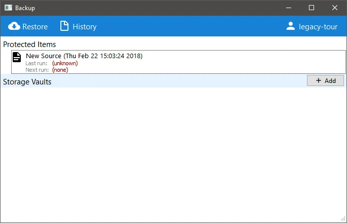
Through some further refinement (removal of buttons on protected items and a few other tweaks) we landed at where we are today:
